


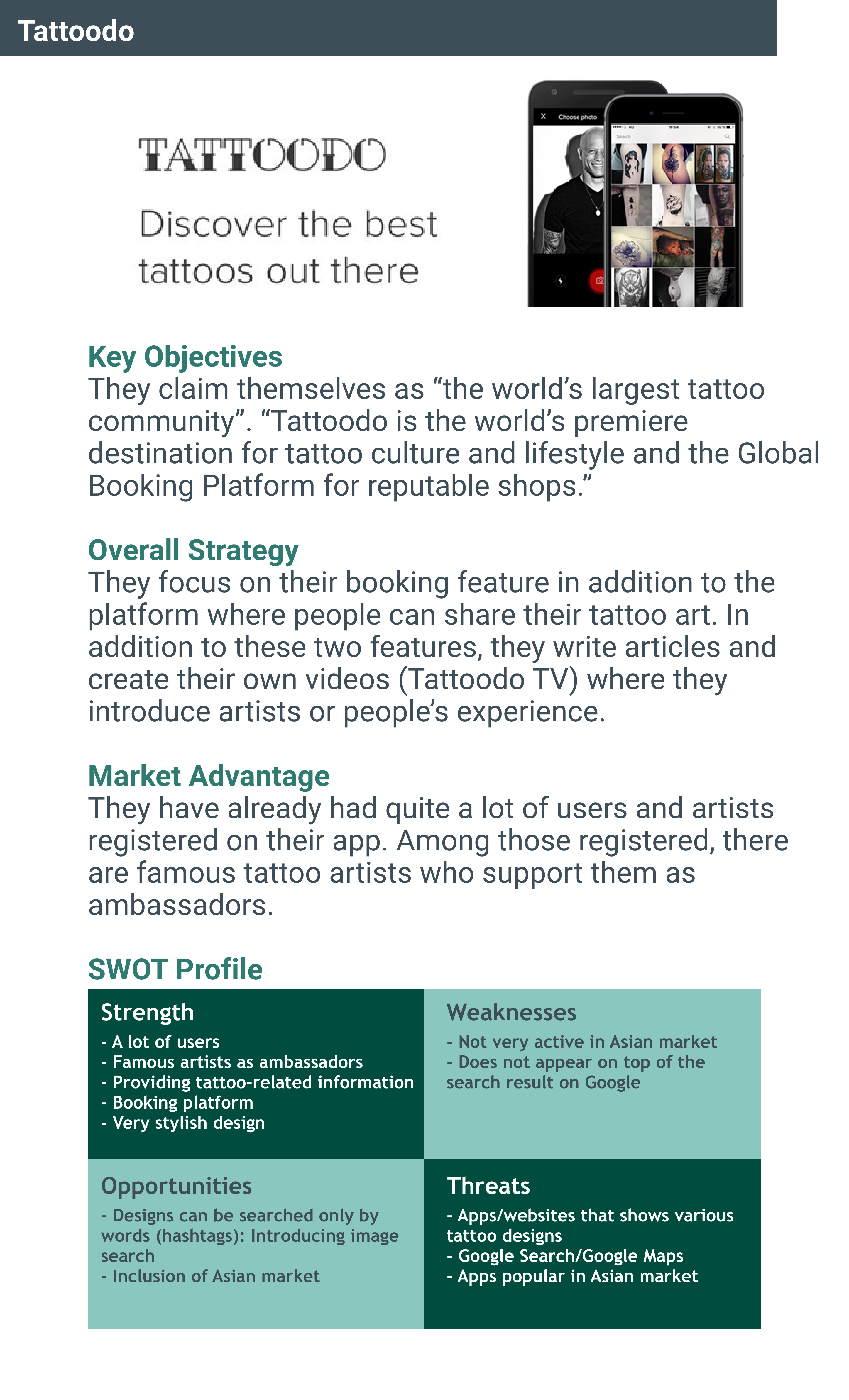
First of all, in order to understand the current tattoo app market, competitive analysis of the following two apps were carried out.

After getting a basic idea of the current market, user interviews were conducted to find out problems that users have. The interview results revealed the following problems.

Based on the user interviews and its results, two user personas and their journey maps were created to help me have a clearer image of target users.


The personas and the journey maps revealed the objectives that users would have in using the app. As a next step, tasks which are required for the completion of those objectives were identified and summarised in the following user flows.


Using the user flows as a basic idea, sitemaps were established to visualise the entire structure of the app. Card sorting was also conducted to confirm the clarity of the structure.

Based on the user flows and the sitemaps above, wireframes were created. The process started from low-fidelity wireframes with a pen and paper, followed by mid-fidelity wireframes created using Balsamiq. Finally, high-fidelity wireframes were made utilising Adobe XD and Sketch.


In order to detect errors and improve the design, moderated in-person usability tests were carried out with 6 test participants. The participants were given some scenario tasks, and the test results were analysed using affinity maps and rainbow spreadsheet.


The errors and other points to improve which were found in the usability tests were addressed in the process of iteration. The changes made through this process include;

Curious how Ink Tank actually works? Click the image below to check clickable prototypes.


